
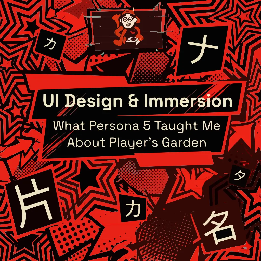
When people talk about great game design, they usually mention story, music, or gameplay systems. But one of the most unforgettable things about Persona 5 is something many games treat as secondary: its user interface.
Menus in most games are simply tools.
You open them, check your stats, save, and move on.
Persona 5 does something different.
Persona 5 is often considered one of the best examples of user interface (UI) design in modern gaming.
Its interface is not just functional — it becomes part of the experience itself.
Every menu transition feels intentional.
Every movement has rhythm.
Every button press feels alive.
Instead of making navigation feel like a pause between moments of gameplay, the UI keeps the player immersed in the world. Atlus has openly described how much effort goes into making each menu distinct and deeply integrated into the game’s identity.
That is what makes it so effective.
Why Persona 5’s UI Works So Well
The first thing that stands out is its bold visual identity.
The use of black, red, white, strong contrast, asymmetrical layouts, and dynamic motion creates a sense of rebellion and momentum that perfectly matches the game’s theme.
But great game UI is never just about looking cool.
What makes Persona 5 UI Design special is the balance between:
- style
- clarity
- feedback
- immersion
Even though the interface is visually loud, it still communicates exactly where the player is and what action is selected. Atlus has mentioned that early versions were actually difficult to read and required extensive iteration before reaching the final result.
That’s an important lesson in UX:
beautiful design means nothing if it slows the user down.
Persona 5 proves that style and usability can coexist.
The “One More Click” Effect
One of the most interesting things about its design is how the interface almost encourages exploration.
You want to keep opening menus.
You want to check items.
You want to browse confidants, stats, personas, maps. Why?
Because the interface itself is satisfying. The animations, transitions, and visual hierarchy make every interaction feel rewarding.
In a way, the UI “pokes” the player to keep going.
It transforms navigation into part of the gameplay loop.
That feeling is incredibly powerful
What It Taught Me About Player’s Garden
This idea has become one of the biggest inspirations behind Player’s Garden. I don’t want learning Japanese to feel like opening a textbook. I want it to feel closer to navigating a stylish JRPG menu.
Something interactive, Something rewarding, Something that makes curiosity feel natural.
That’s why I’m building tools and pages that feel more like game interfaces for learners than traditional study resources.
Instead of:
study → memorize → repeat
I want the experience to feel like:
explore → discover → interact
Almost like moving through a game world.
The goal is simple:
make learning feel immersive, not academic.